Unlock Insights: Your Detailed Guide to Using Excel for Data Analysis and Reporting
Microsoft Excel is more than just a spreadsheet program; it’s a powerful tool for data analysis and reporting. Over the years, I’ve relied on Excel to transform raw data into actionable insights, and I’ve seen countless others do the same. Whether you’re a small business owner, a student, or anyone dealing with data, mastering Excel for analysis can significantly enhance your understanding and decision-making. This guide will walk you through the essential steps to effectively use Excel for your data needs.
Step 1: Getting Your Data into Excel – Importing and Organizing
The first step is to get your data into Excel in a structured format.
- Enter Data Manually: If you have a small dataset, you can manually type the data into the cells. Ensure each column has a clear header describing the data it contains (e.g., “Sales Date,” “Product Name,” “Quantity,” “Price”).
- Import Data from External Sources: Excel can import data from various sources:
- Text Files (CSV, TXT): Go to Data > Get Data > From File > From Text/CSV. Select your file and follow the prompts. You’ll often need to specify the delimiter (e.g., comma, tab).
- Databases (SQL Server, Access, etc.): Go to Data > Get Data > From Database and choose your database type. You’ll need connection details to access the database.
- Web Pages: Go to Data > Get Data > From Web. Enter the URL of the web page containing the data. Excel will try to identify tables on the page.
- Organize Your Data: Once imported, ensure your data is well-organized.
- Consistent Formatting: Maintain consistent formatting for dates, numbers, and text within each column.
- No Empty Rows or Columns (within the data): Remove any unnecessary empty rows or columns that might interfere with analysis.
- Single Header Row: Ensure your data has only one header row at the top that clearly labels each column.
Step 2: Basic Data Exploration – Getting a Feel for Your Numbers
Before diving into complex analysis, it’s helpful to get a basic understanding of your data.
- Sorting: Select the data you want to sort, then go to Data > Sort. You can sort by one or multiple columns in ascending or descending order. I often use sorting to quickly identify top-performing products or the latest sales.
- Filtering: To focus on specific subsets of your data, use filtering. Select your header row, then go to Data > Filter. Drop-down arrows will appear in each header. Click an arrow to choose specific values or conditions to filter by. Filtering is invaluable for analyzing data for a particular region or time period.
- Basic Formulas: Use simple formulas to calculate basic statistics:
- SUM(): Adds up numbers in a range of cells (e.g., =SUM(C2:C10) to sum values in cells C2 through C10).
- AVERAGE(): Calculates the average of numbers in a range (e.g., =AVERAGE(D2:D10)).
- COUNT(): Counts the number of cells in a range that contain numbers (e.g., =COUNT(A2:A20)).
- COUNTA(): Counts the number of non-empty cells in a range (e.g., =COUNTA(B2:B20)).
- MIN(): Finds the smallest number in a range (e.g., =MIN(E2:E15)).
- MAX(): Finds the largest number in a range (e.g., =MAX(F2:F15)). Enter these formulas into empty cells where you want the results to appear.
Step 3: Leveraging Powerful Functions for Deeper Analysis
Excel boasts a wide array of functions for more advanced data analysis.
- IF(): Performs a logical test and returns one value if true and another if false (e.g., =IF(G2>100,”High”,”Low”) to categorize sales as “High” if greater than 100, otherwise “Low”). I frequently use IF statements to create categories or flags based on specific conditions.
- COUNTIF() and COUNTIFS(): Count cells within a range that meet given criteria (e.g., =COUNTIF(B2:B20,”Electronics”) to count the number of “Electronics” products). COUNTIFS allows for multiple criteria.
- SUMIF() and SUMIFS(): Sum cells within a range that meet given criteria (e.g., =SUMIF(B2:B20,”Electronics”,C2:C20) to sum the quantities of “Electronics” products). SUMIFS allows for multiple criteria.
- AVERAGEIF() and AVERAGEIFS(): Calculate the average of cells within a range that meet given criteria.
- VLOOKUP() and HLOOKUP(): Search for a value in the first column (VLOOKUP) or first row (HLOOKUP) of a table and return a value in the same row from a specified column. These are incredibly useful for combining data from different tables.
- INDEX() and MATCH(): These functions can be used together to perform more flexible lookups than VLOOKUP or HLOOKUP.
- TEXT(): Formats a number as text in a specific way (e.g., =TEXT(A1,”yyyy-mm-dd”) to format a date in a specific format).
Explore Excel’s “Formulas” tab to discover the vast library of functions available, categorized by function type (e.g., Logical, Text, Date & Time, Lookup & Reference, Math & Trig, Statistical).
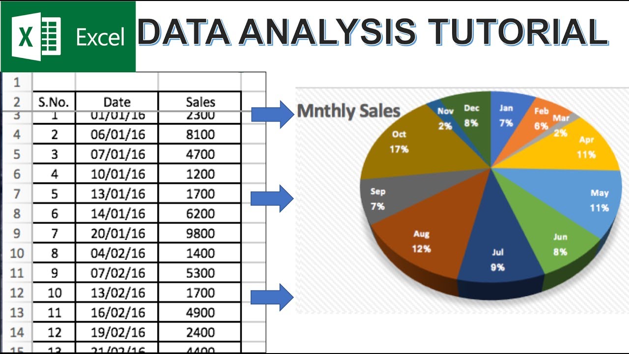
Step 4: Visualizing Your Data with Charts
Charts can make complex data easier to understand and communicate.
- Select Your Data: Select the cells containing the data you want to chart, including headers.
- Go to the “Insert” Tab: In the “Charts” group, choose the chart type that best represents your data:
- Column Charts: Good for comparing values across categories.
- Line Charts: Useful for showing trends over time.
- Pie Charts: Show proportions of a whole (use sparingly as they can be difficult to interpret with many slices).
- Bar Charts: Similar to column charts but display data horizontally.
- Scatter Charts: Show the relationship between two sets of numerical data.
- Customize Your Chart: Once you’ve inserted a chart, you can customize its appearance using the “Chart Design” and “Format” tabs that appear. You can change colors, add titles, labels, and legends to make your chart clear and informative. I always spend time customizing charts to ensure they effectively convey the intended message.
Step 5: Creating Dynamic Reports with PivotTables
PivotTables are a powerful feature in Excel that allows you to summarize and analyze large amounts of data with ease.
- Select Your Data: Select the entire range of your data, including headers.
- Go to “Insert” > “PivotTable”: In the “Create PivotTable” dialog box, confirm the data range and choose where you want to place the PivotTable (a new worksheet is usually recommended). Click “OK.”
- Build Your Report: The “PivotTable Fields” pane will appear. Drag and drop the column headers from this pane into the four areas at the bottom:
- Rows: Fields placed here will appear as rows in your PivotTable.
- Columns: Fields placed here will appear as columns.
- Values: Fields placed here will be summarized (e.g., sum, average, count). You’ll typically drag numerical fields here.
- Filters: Fields placed here can be used to filter the entire PivotTable.
- Customize Your PivotTable: You can customize how your data is summarized and displayed. Click on a value field in the PivotTable and choose “Value Field Settings” to change the calculation type (e.g., from Sum to Average). You can also group data by date, text, or numbers. PivotTables are incredibly versatile for creating dynamic summaries and exploring different perspectives on your data. I use them extensively for creating sales reports and analyzing trends.
Step 6: Enhancing Your Analysis with Conditional Formatting
Conditional formatting allows you to automatically apply formatting (like colors, icons, and data bars) to cells based on their values. This can help you quickly identify trends and outliers in your data.
- Select Your Data: Select the range of cells you want to apply conditional formatting to.
- Go to “Home” > “Conditional Formatting”: Choose from various options, such as:
- Highlight Cell Rules: Format cells based on comparisons to a specific value or text.
- Top/Bottom Rules: Highlight the top or bottom values or percentages.
- Data Bars: Display bars within cells to visually represent their values relative to other cells in the range.
- Color Scales: Apply a gradient of colors to cells based on their values.
- Icon Sets: Add icons to cells to represent their values relative to other cells.
- Customize Your Rules: You can customize the formatting rules to fit your specific needs. Conditional formatting can make your data much easier to interpret at a glance.
Step 7: Sharing Your Insights – Reporting Your Findings
Once you’ve analyzed your data, you’ll likely need to share your findings.
- Organize Your Worksheet: Arrange your charts and PivotTables in a clear and logical manner on your worksheet.
- Add Text and Explanations: Use text boxes and comments to provide context and explain the key insights from your analysis.
- Create a Summary Sheet: Consider creating a separate sheet that summarizes your main findings and conclusions.
- Print or Share Electronically: You can print your worksheet or share the Excel file electronically. You can also copy and paste charts and tables into other documents or presentations.
- Consider Exporting to Other Formats: For wider sharing, you might export your data or charts to formats like PDF or images.
My Personal Journey with Excel for Data Analysis
I remember when I first started using Excel for data analysis, I was overwhelmed by the sheer number of features. However, by gradually learning and applying these techniques, I’ve become much more efficient at extracting valuable insights from data. Whether it’s tracking website performance, analyzing sales figures, or managing project data, Excel has consistently proven to be an indispensable tool. The key is to practice regularly and explore the various functionalities to discover what works best for your specific needs.